


01 / The Challenge
The Orange Beach Open is no ordinary fishing tournament; it’s all about old-school fun, memories, and friendly camaraderie. So when we were asked to cast a new line and give the event a fresh identity, we were all in.
Starting from scratch? Those words can sound daunting, but it’s just what Orange Beach Open Needed. The previous logo, while functional, lacked the pizzazz and unique character that set this event apart. The client was fishing for something new – a total overhaul that would incorporate an artificial trolling lure, highlighting the event’s trolling-only rule.
02 / Our Strategy
Casting Creativity, Catching Fun
We were given free rein on the design and color scheme, which meant we had the opportunity to create something truly special. Our approach was to design a logo that embodied the event’s spirit – fun, energetic, lively, and family-friendly! It all came down to incorporating vibrant colors, dynamic illustrations, and unique shapes we could create with a fishing line!
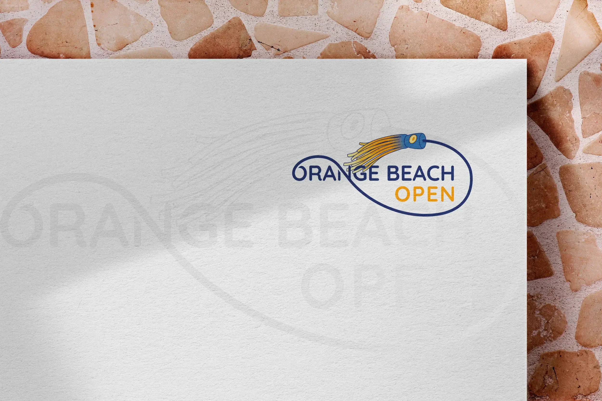
03 / Logo Redesign
A Logo to Lure You In
We plunged headfirst on our mission to create a lure icon that was as dynamic and authentic as the event itself. Not about throwing spaghetti at the wall to see what sticks, we pulled references of lures in action to ensure the final design was a real catch. A pop of sunset orange here and a splash of deep sea blue there captured the tournament’s lively vibe. And not to geek out on fonts, but we found an organic, playful, yet clean typeface – a perfect match for the skirted lure and swirling line. The result? A logo that’s as full of life and energy as the Orange Beach Open itself.

OLD DESIGN

NEW DESIGN

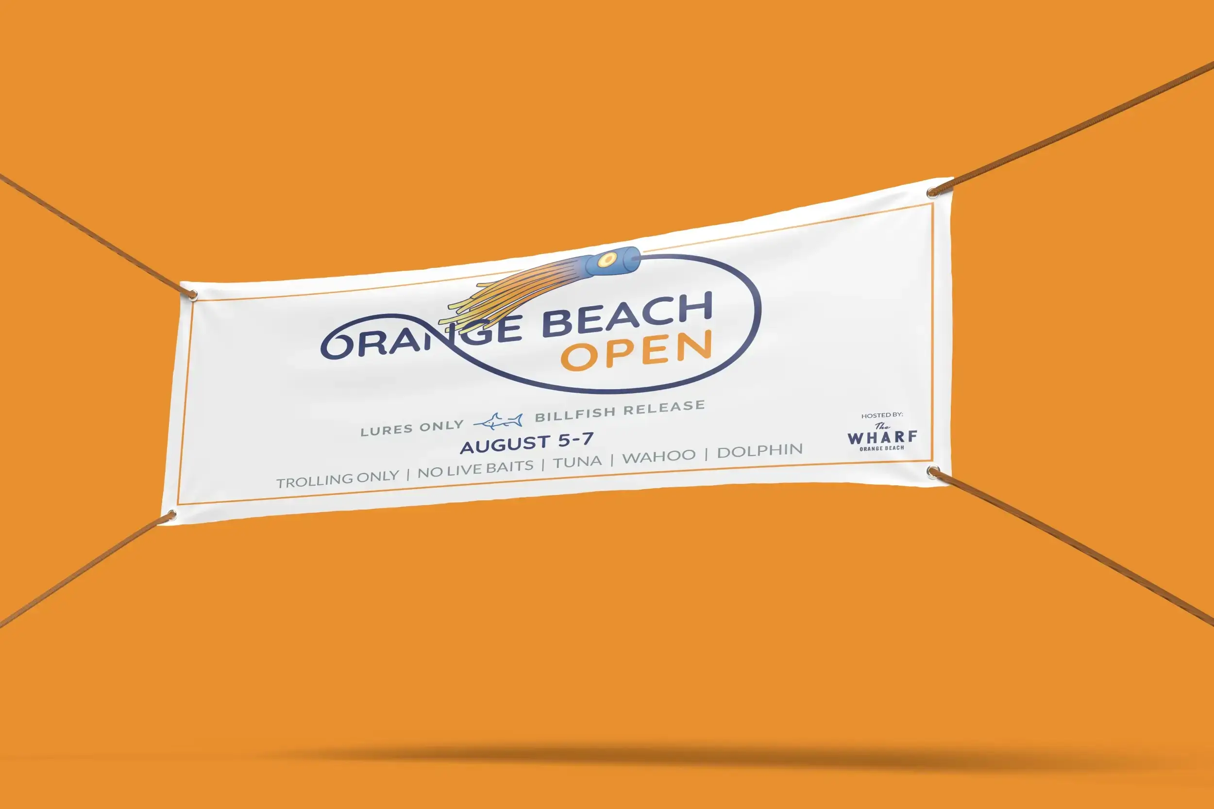
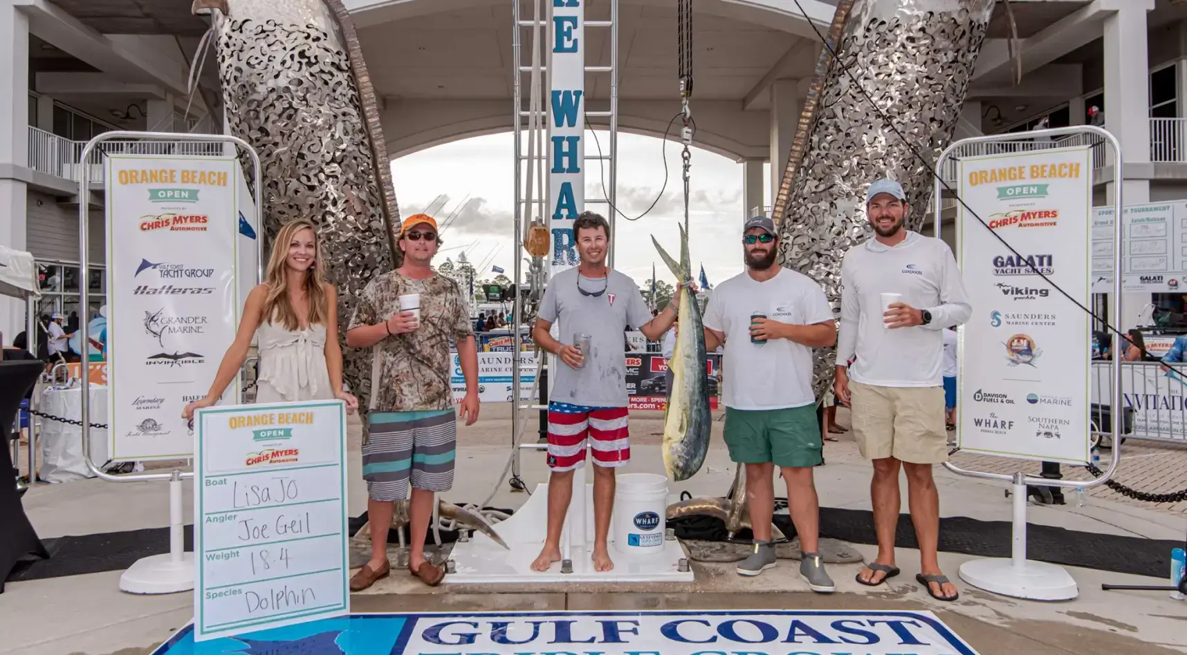
04 / Branded Event Materials
Anchoring Event Success with Unified Design
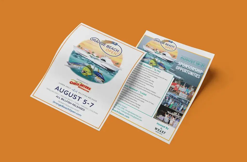
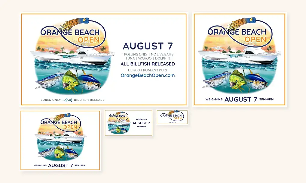
Pumping out eye-catching event graphics for our friends at the Orange Beach Open wasn’t new for us. From banners to digital ads, these materials featuring a colorful illustration of a boating scene were a hit. So naturally, we wanted to keep riding that wave. This time, we needed to make sure that the new branding played nice with the recognizable coastal imagery. People talk about making things pop all the time, but sometimes it’s the sight of a balanced design that is a true delight for the eyes.
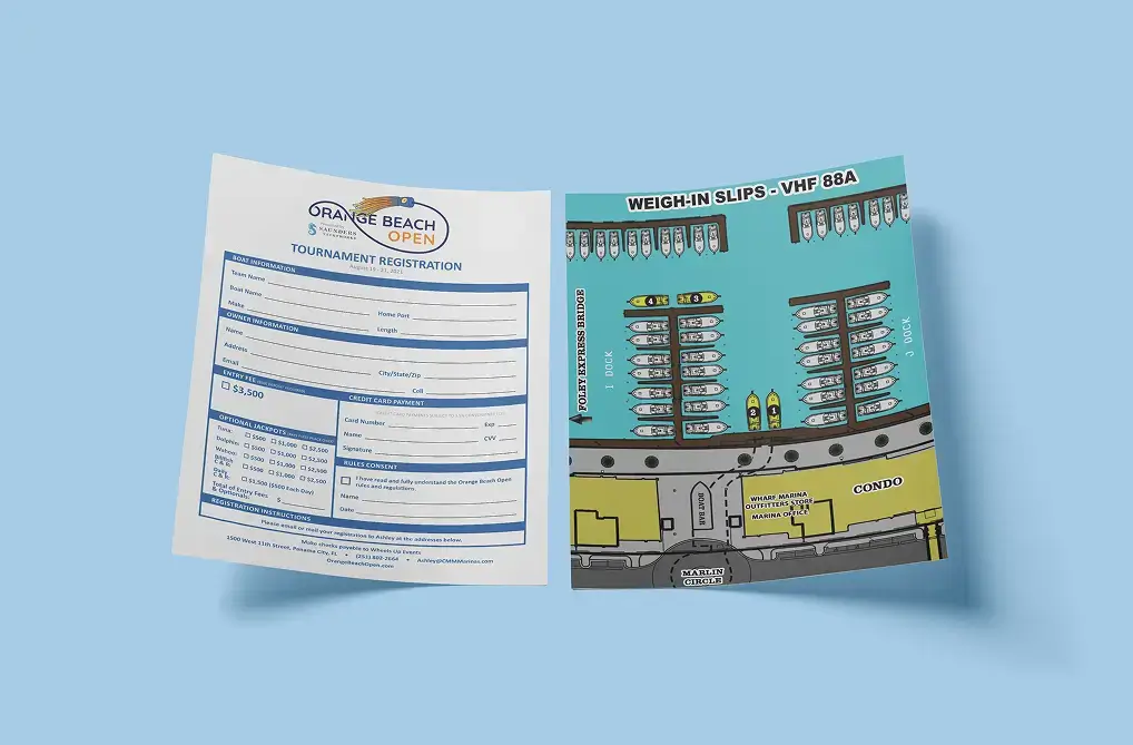
But we also like things to pop just the right amount and shout, “You can’t miss this!” That’s why no element, not even the registration forms, was overlooked when it came to style. The event map was carefully designed to make it easy to find where the fun was happening at various spots near the docks of The Wharf Marina. The sponsor banners helped not only recognize but truly spotlight the incredible sponsors, creating a win-win for everyone involved.
05 / The Results
The Orange Beach Open stands apart from the sea of similar fishing tournaments, and now it has a logo that does too. The redesign didn’t just enhance the event’s visual appeal; it captured a fresh wave of energy and enthusiasm that’s always been at the heart of the event.