


01 / The Challenge
Episcopal Churches of PCB represented two congregations, but their digital presence did not clearly reflect that shared identity.
Grace Episcopal Church and St. Thomas by the Sea each had their own history and community, but their website did not clearly show how they connected.
Key information like service times, ministries, events, and giving was available, yet it wasn’t presented in a way that felt organized. Visitors needed a clearer, simpler path to understand both churches and how they related to one another.
02 / Our Strategy
Built Around a Shared Purpose
Our strategy focused on creating a strong shared foundation for both congregations. Rather than treating them as separate entities competing for attention, we developed a system that supported a unified identity while honoring the distinct personality of each church.

03 / Branding
Building on What Was Already There
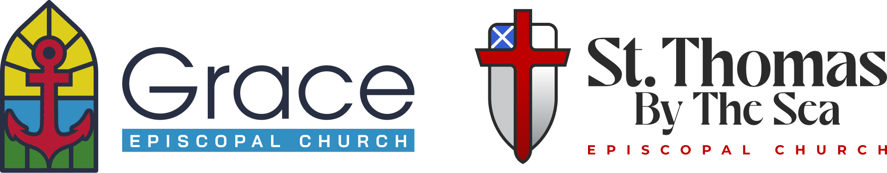
Rather than reinventing who they were, we built on what already felt familiar. The churches already had meaningful symbols and established colors. We refined those elements for better personality, legibility, and clarity across digital and print formats.
For Grace Episcopal Church, we used the anchor as the primary symbol and leaned into the stained glass inspiration to reflect tradition and faith in a more polished way.
For St. Thomas by the Sea, we refined the cross and shield, simplifying the structure and typography so it feels stronger and easier to read at any size.
For the main Episcopal Churches of PCB identity, we combined visual elements that represent both congregations and introduced the emerald water tone the client wanted, subtly tying the brand to its coastal location.
Together, the marks feel related without losing their individual character.
04 / Web Design
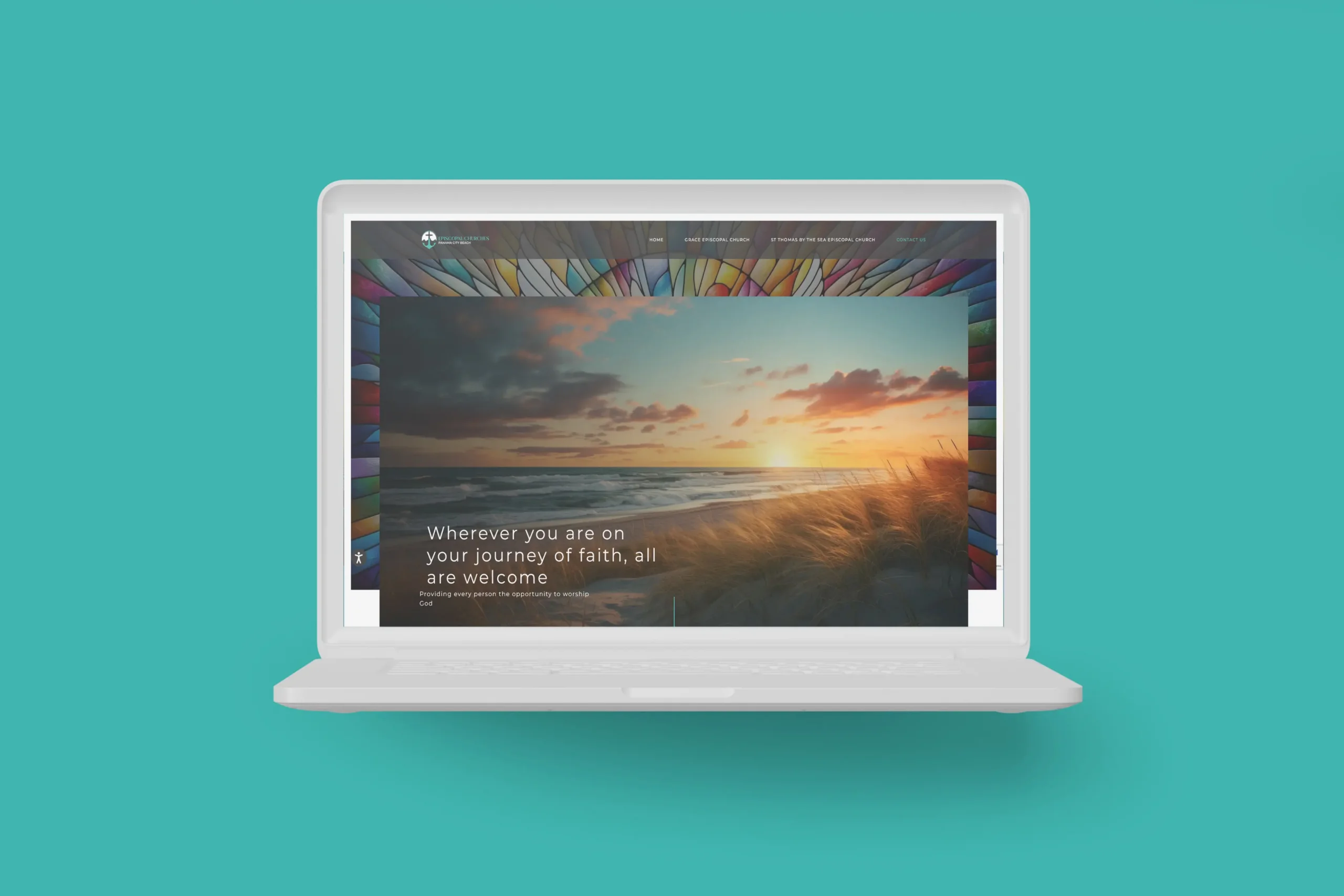
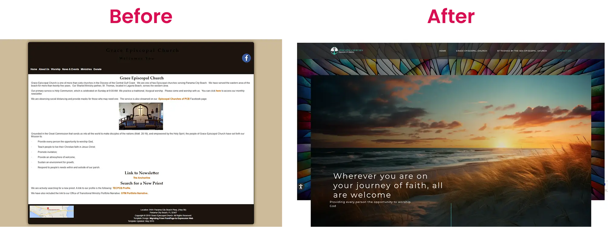
From Outdated to Organized
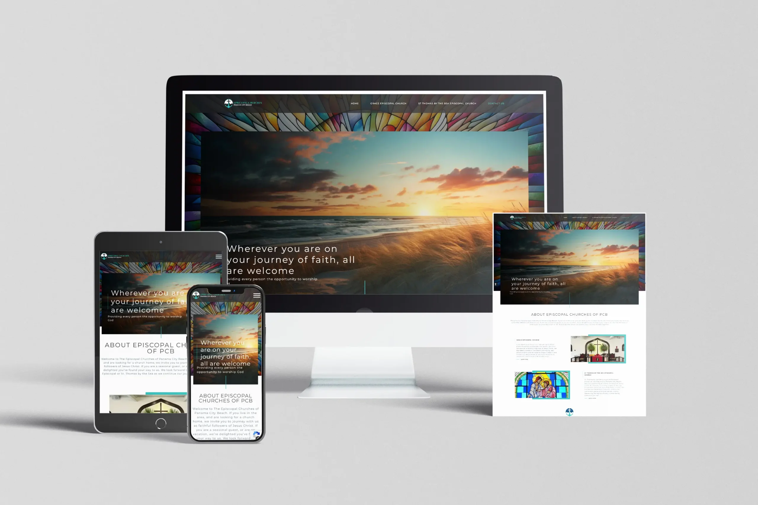
The previous site felt dated and difficult to navigate. We redesigned the structure from the ground up, creating a clean layout that made information easier to find and easier to understand.
Clear navigation, intuitive page layouts, and consistent visual styling allowed the updated branding and messaging to feel intentional instead of cluttered. The story of how the two churches connect is now presented in a way that feels natural and easy to follow.
05 / Web Development
Built for Real Use
Beyond appearance, we rebuilt the site with functionality that supports each congregation’s day-to-day needs.
Each church now has its own events calendar, organized service information, and dedicated pages for giving, documents, and updates. The site is fully responsive, ensuring it works just as smoothly on a phone as it does on a desktop.
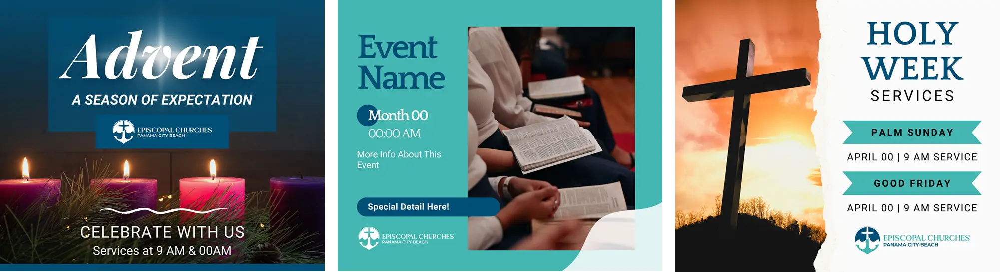
04 / Design Support
Ready-to-Use Brand Tools
To help the churches begin using their new branding right away, we created a set of Canva and email templates for common needs like Holy Week, Advent, events, and announcements.
Each template carries the updated logos, colors, and typography, making it easy for their team to create polished graphics and emails without starting from scratch.
05 / The Results
Clearer. Stronger.
Ready for What’s Next.
What was once dated and difficult to navigate is now organized, modern, and easy to use. The churches now have a cohesive identity and a website that supports communication, events, and ongoing ministry.