01 / The Challenge
Revamping a clinic’s branding? That’s our kind of remedy! Pain Clinic of Northwest Florida approached us, seeking a modern touch for their cherished logo and a fresh vision for their online presence. Challenge accepted!
In a world where image is everything, our friends at Pain Clinic of Northwest Florida felt their trusty logo wasn’t quite reflecting the cutting-edge nature of their rapidly advancing treatments. Their goal was to appeal to today’s audience while staying true to their core values of hope, transformation, and medical expertise. So, we embarked on a mission to finesse their butterfly motif, channeling themes of renewal and metamorphosis.
02 / Our Strategy
Strategic Tweaks. Big Impact
Our client needed more of a fresh remix rather than an entire redo. Our Strategy? Make sure that while the new design elements got the makeover they deserved, they also honored the original. The goal was to prevent the need for a complete overhaul of existing infrastructural branding assets, like their physical signage. Not every brand refresh has to be a whole grand production. Sometimes, it’s just about finding those perfect little tweaks that make all the difference. We’re here for that.

03 / Logo Refresh
A Metamorphosis Moment Branding-Style
Collaboratively, we breathed new life into the butterfly logo, blending in hues of blue and green to evoke feelings of tranquility, healing, and renewal. Our strategic decision to stack the text was a nod to modern design aesthetics, ensuring clarity and a decluttered look.
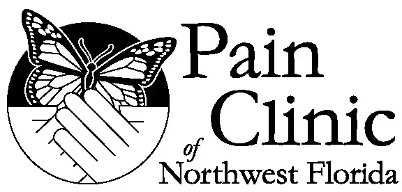
OLD DESIGN

NEW DESIGN

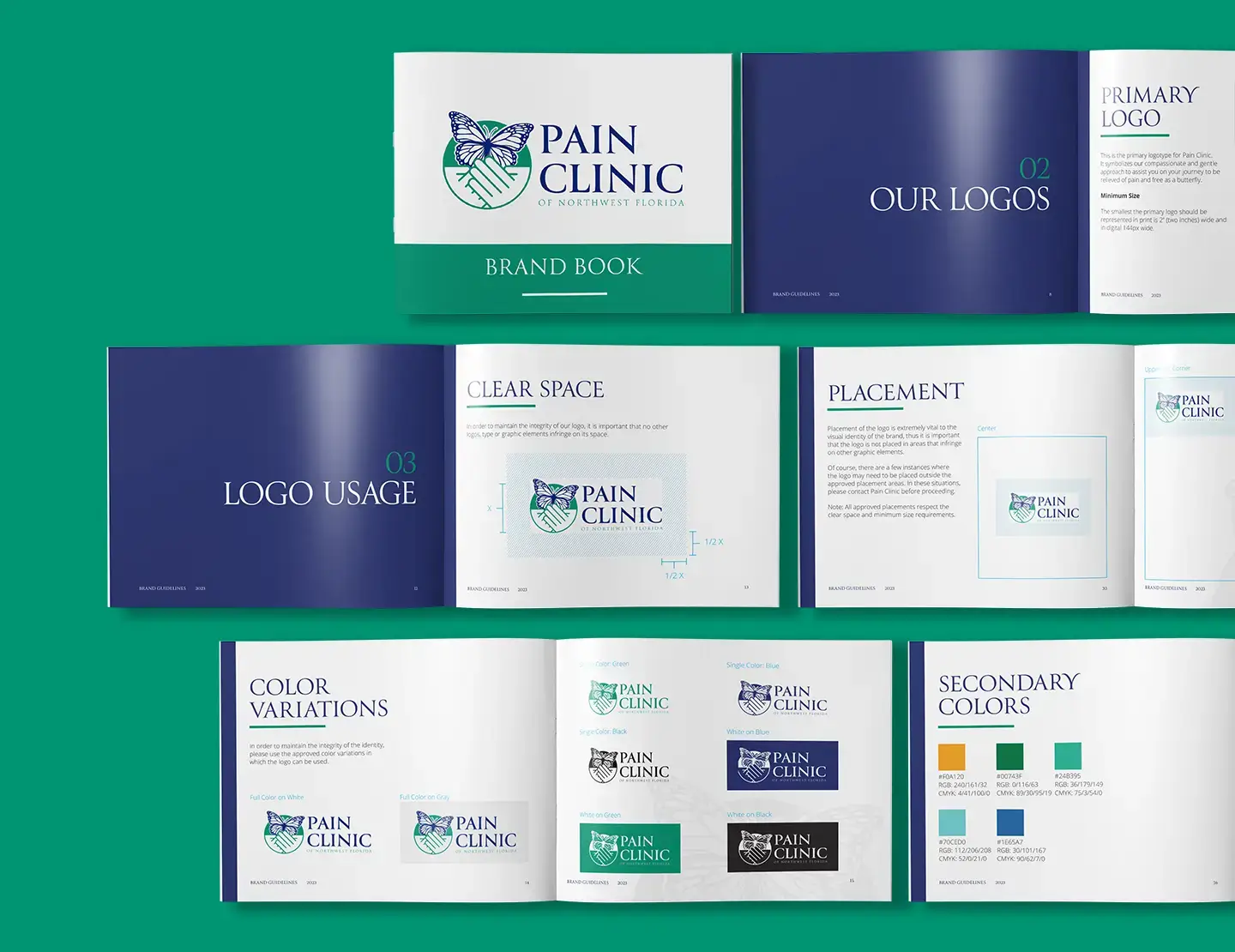
04 / Branding Guide
Blueprint of a Brand: Every Shade, Shape and Script
But we didn’t stop at the logo. We distilled the Pain Clinic of Northwest Florida’s spirit into a polished brand guide. From colors and fonts to the nitty-gritty of branding, this guide is the roadmap to their consistent and captivating brand identity.


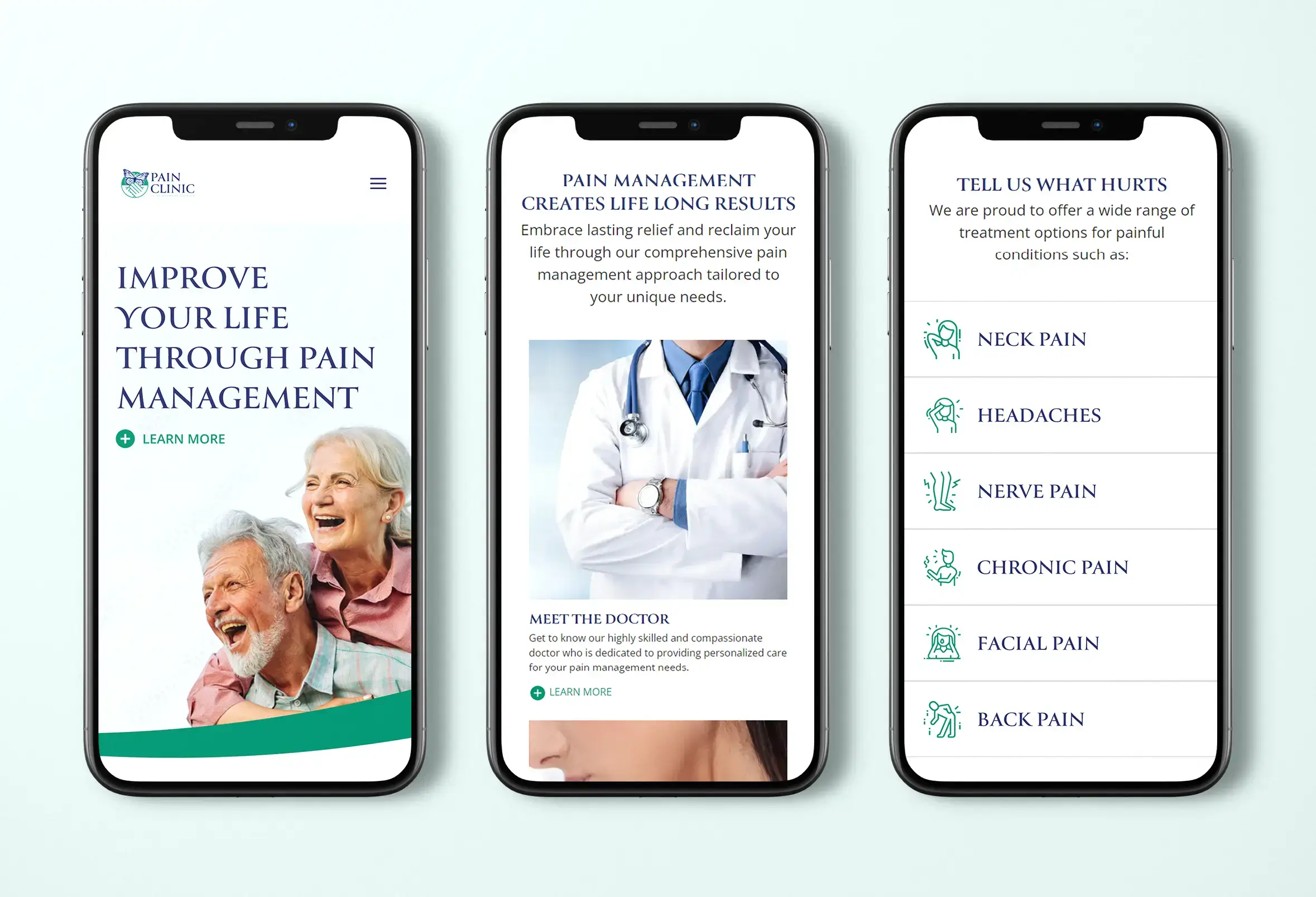
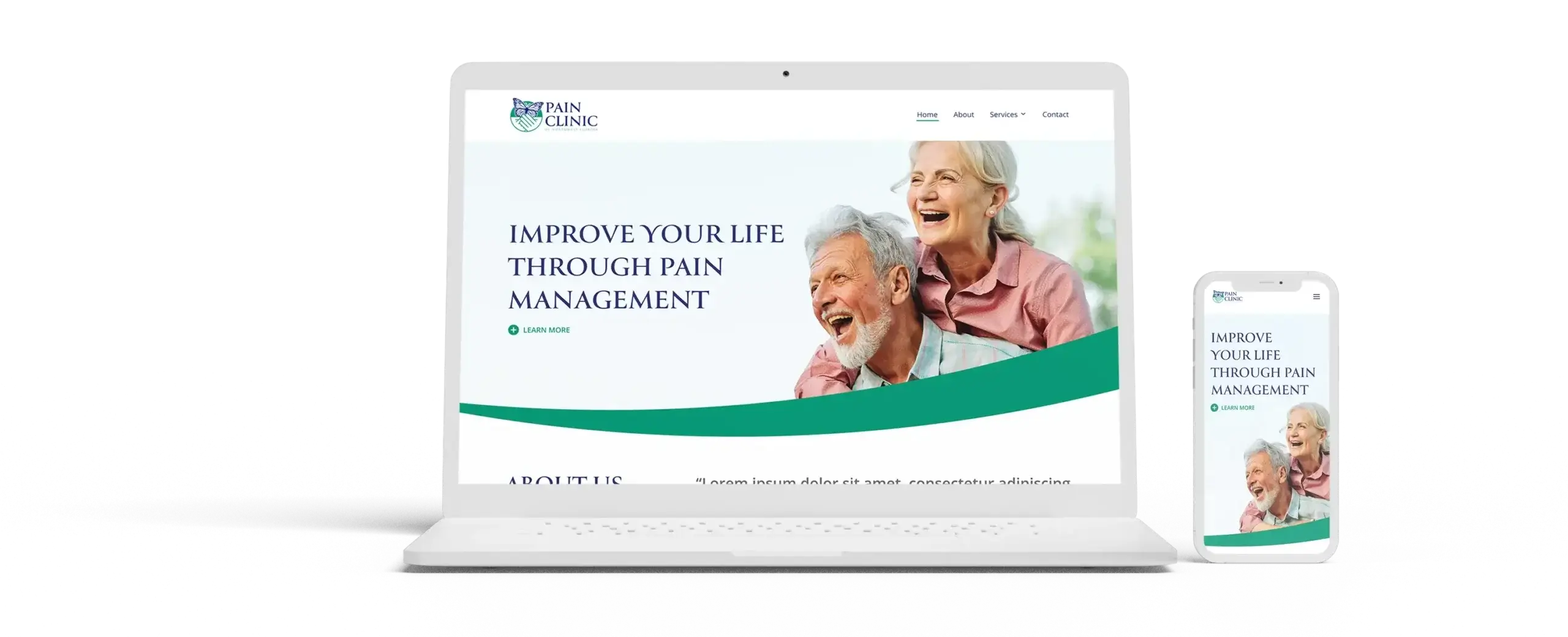
05 / Web Design & Development
From Bytes to Bliss: A Website with Wellness Woven In
Diving deeper with Pain Clinic of Northwest Florida, our adventure was about more than just a spruced-up logo. We developed a patient-centric website encapsulating the newly minted branding ethos. Our prime focus was to create a serene space reflecting understanding, compassion, and above all, solutions. With the therapeutic green highlights and the pronounced blue text, we ensured the site was both comforting and intuitive. And because medical jargon can feel like a maze, we kept the navigation simple, organizing treatments and conditions by where it hurts to make the user journey as painless as possible.

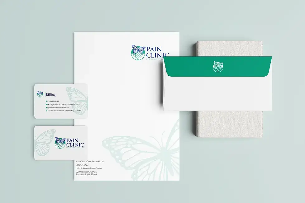
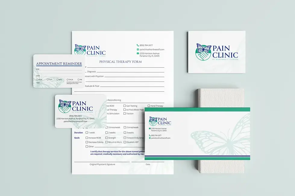
06 / Stationary Design
Brand in Your Hand: Letterheads, Business Cards, & More!
But the story doesn’t end online. We amplified the Pain Clinic of Northwest Florida’s fresh identity across a medley of branded items. This comprehensive package encompassed everything from business cards and envelopes to letterheads and appointment cards. Whether it’s paper in hand or pixels on a screen, we ensured Pain Clinic of Northwest Florida’s brand was consistently felt and recognized.