


01 / The Challenge
Known as the “Greatest Show In Sportfishing,” the Blue Marlin Grand Championship is where excitement meets elegance at the Wharf Marina. So, when their surging fame called for a brand versatile enough to ride the wave, Curiosity was ready to dive deep.
With booming popularity and swelling crowds, the Blue Marlin Grand Championship’s existing identity was struggling to keep pace. The ornate design, though expressive, was more of an anchor than a sail, proving cumbersome for diverse applications – from embroidered merchandise to simplistic prints for fan favorites like koozies. The task? Not just a logo refresh but charting a course for a future-focused identity.
02 / Our Strategy
Navigating Modernity Without
Losing Legacy
When tasked with reshaping the brand, we steered toward modernity yet knew the importance of honoring its rich heritage. Our strategic compass pointed us to sleek, contemporary fonts that boasted charisma without compromise. The goal? A robust and adaptable identity that would echo the vigor of the iconic fish illustration from the original branding while ensuring a seamless transition for existing event materials. We were in pursuit of a balance – a harmonious blend of the new with the familiar, ensuring the rebrand wouldn’t leave loyal fans feeling marooned.
03 / Logo Redesign
Making Simple Shapes Tell Big Stories
How do you capture the exhilarating battle of reeling in a Blue Marlin with just simple shapes? Not easy, but we’re suckers for a good challenge. Distilling the Marlin’s raw power into clear forms, we worked to encapsulate that iconic tug-of-war. Incorporating he original text colors anchored our design in tradition, while our font picks were unapologetically bold, modern, yet welcoming—ensuring standout visibility from afar and effortless transitions onto merchandise. The result? A logo as gripping as the event it represents.
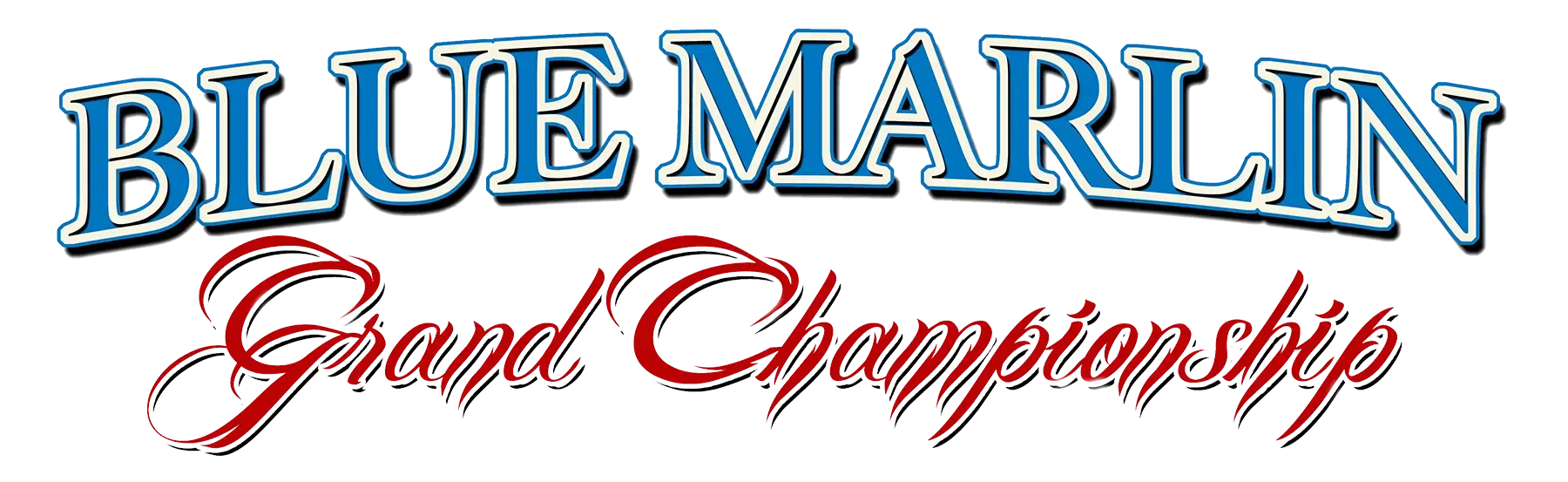
OLD DESIGN

NEW DESIGN
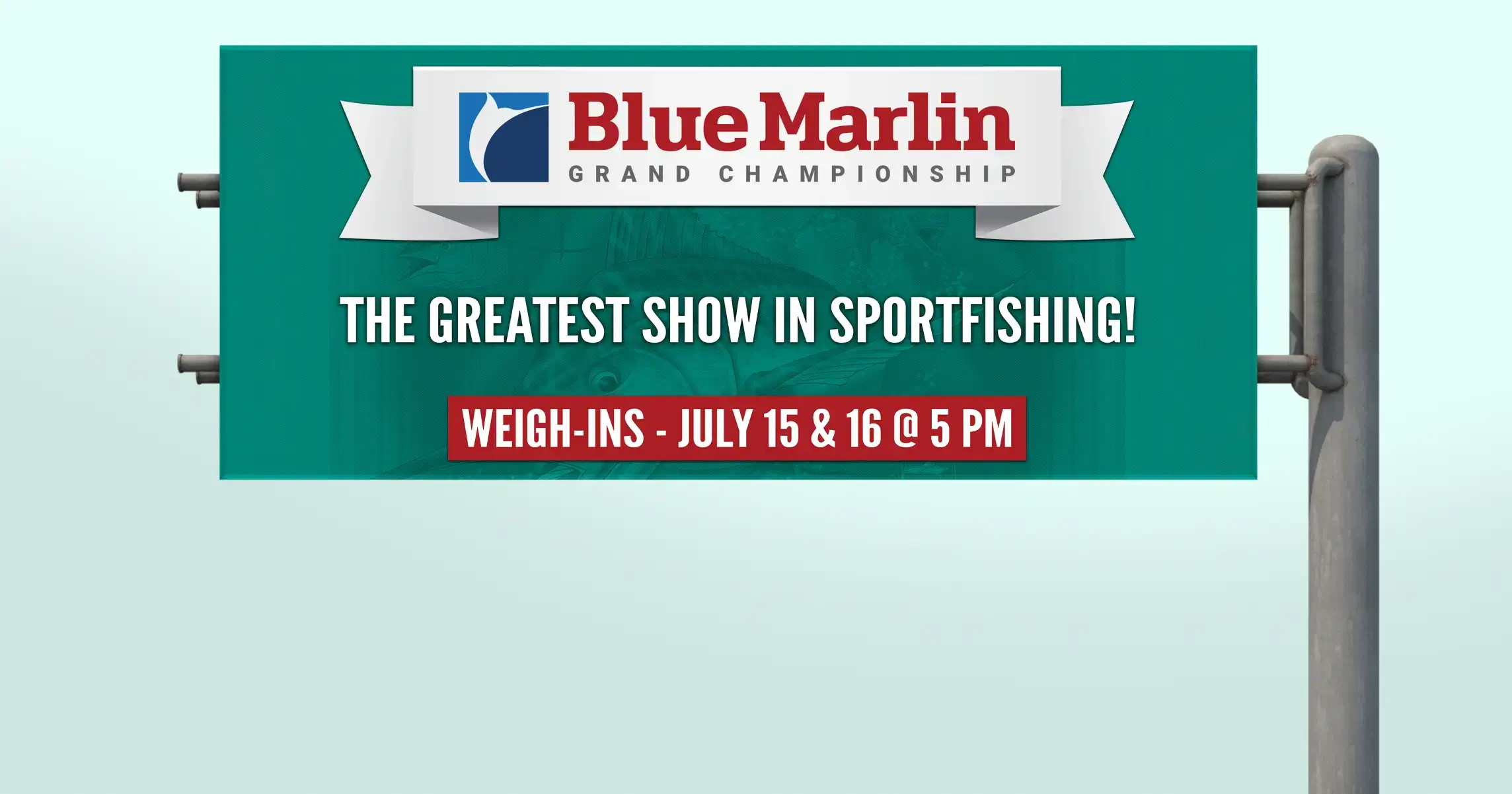
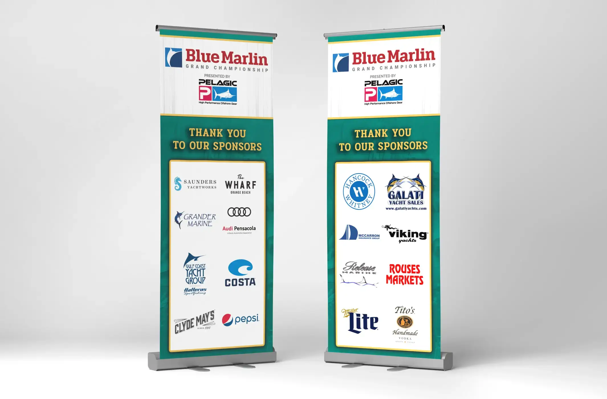
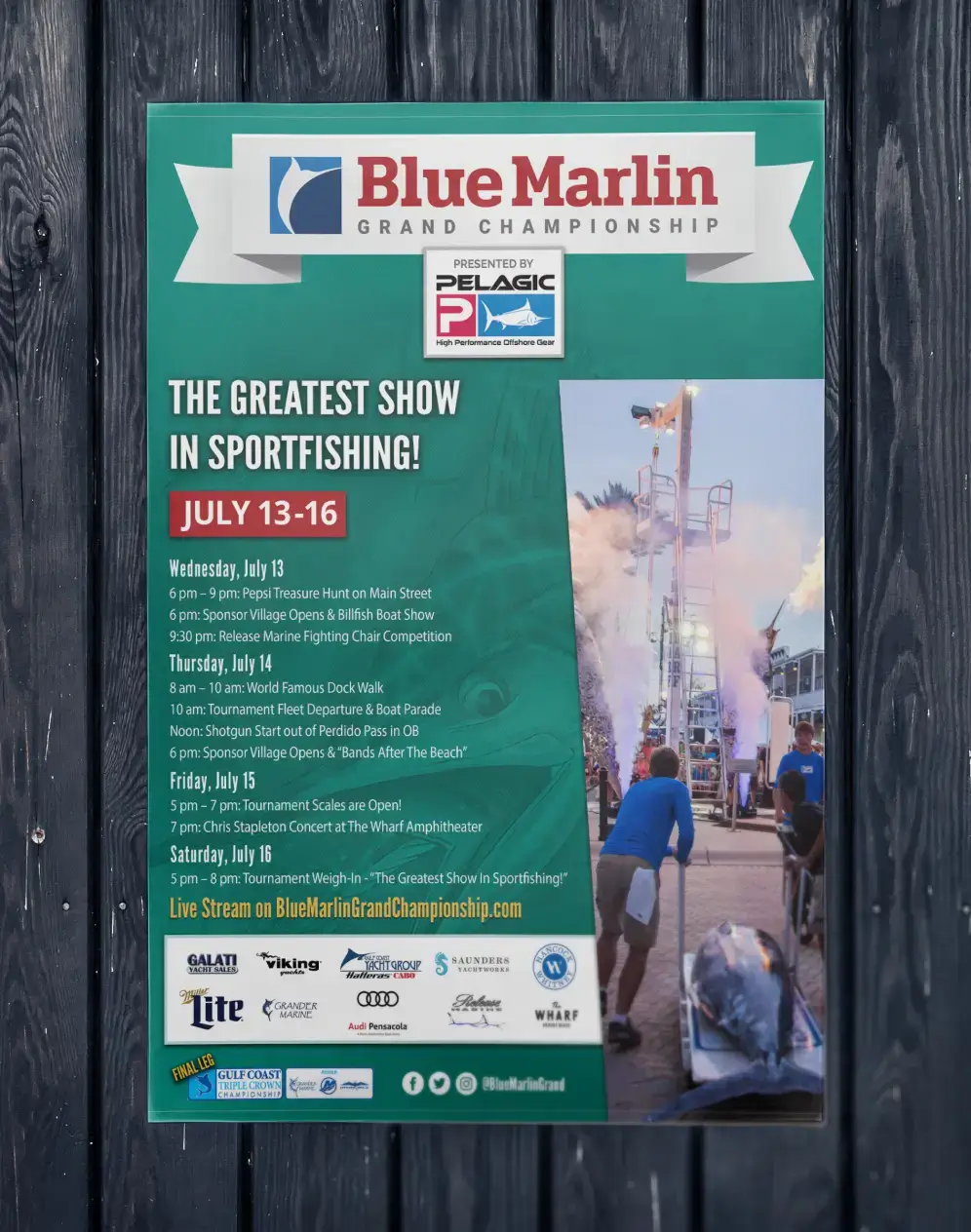
04 / Branded Event Materials
From Posters to Pixels: All Bases Covered
Crafting standout event graphics for the Blue Marlin Grand Championship has been our jam long before the brand got its fresh face. We’ve been setting the design stage for this sportfishing spectacle, from massive event banners to digital ads, with all the flair you’d expect from us.
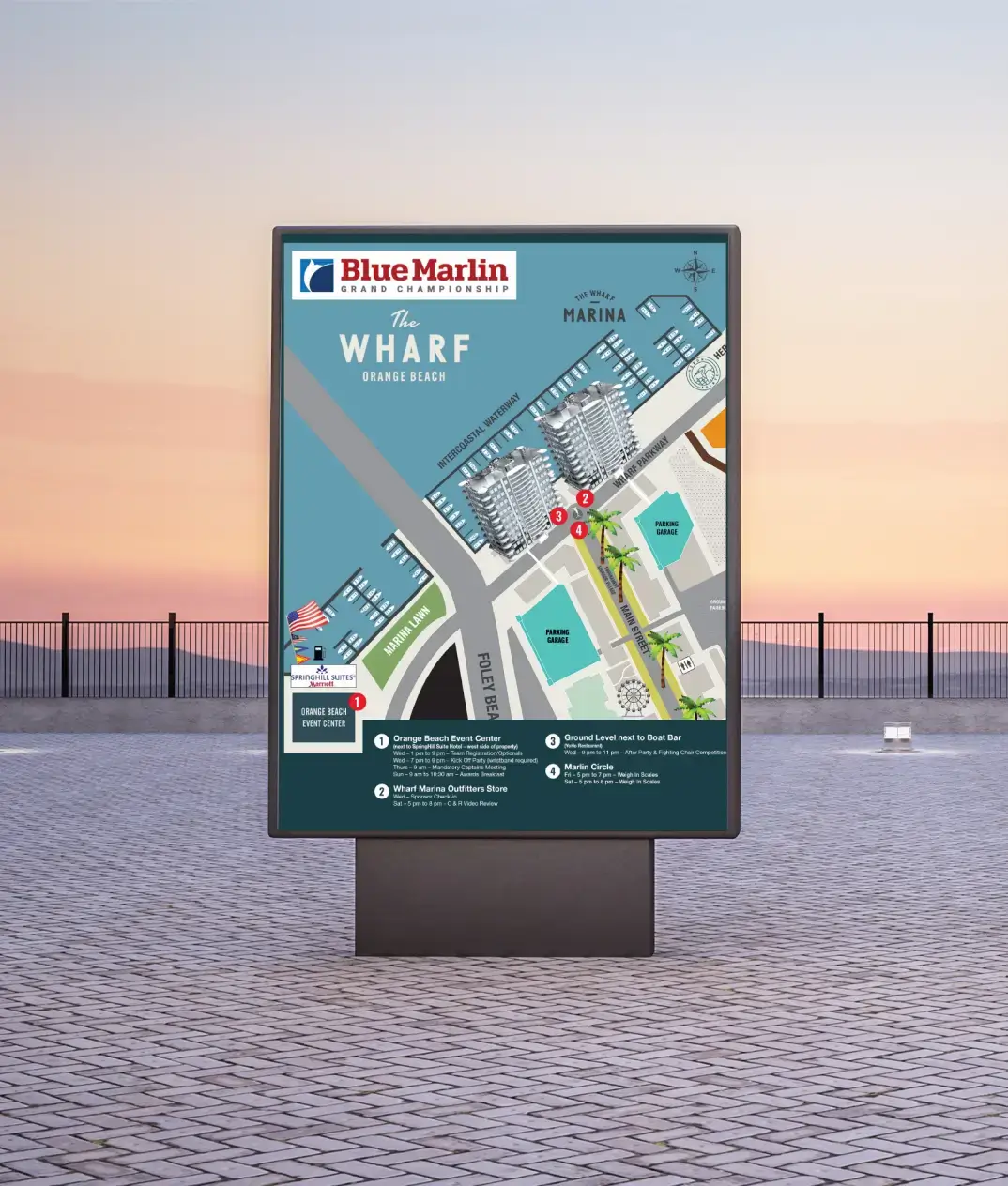
Armed with our streamlined logo, the event name took center stage, demanding attention no matter its size or distance. That’s the beauty of smart design—it scales. From detailed event maps and eye-grabbing road signs to striking magazine placements, every piece captured the essence of the Blue Marlin Grand Championship with a hint of something new.

05 / Web Design and Development
Lean Layout, Loaded Experience
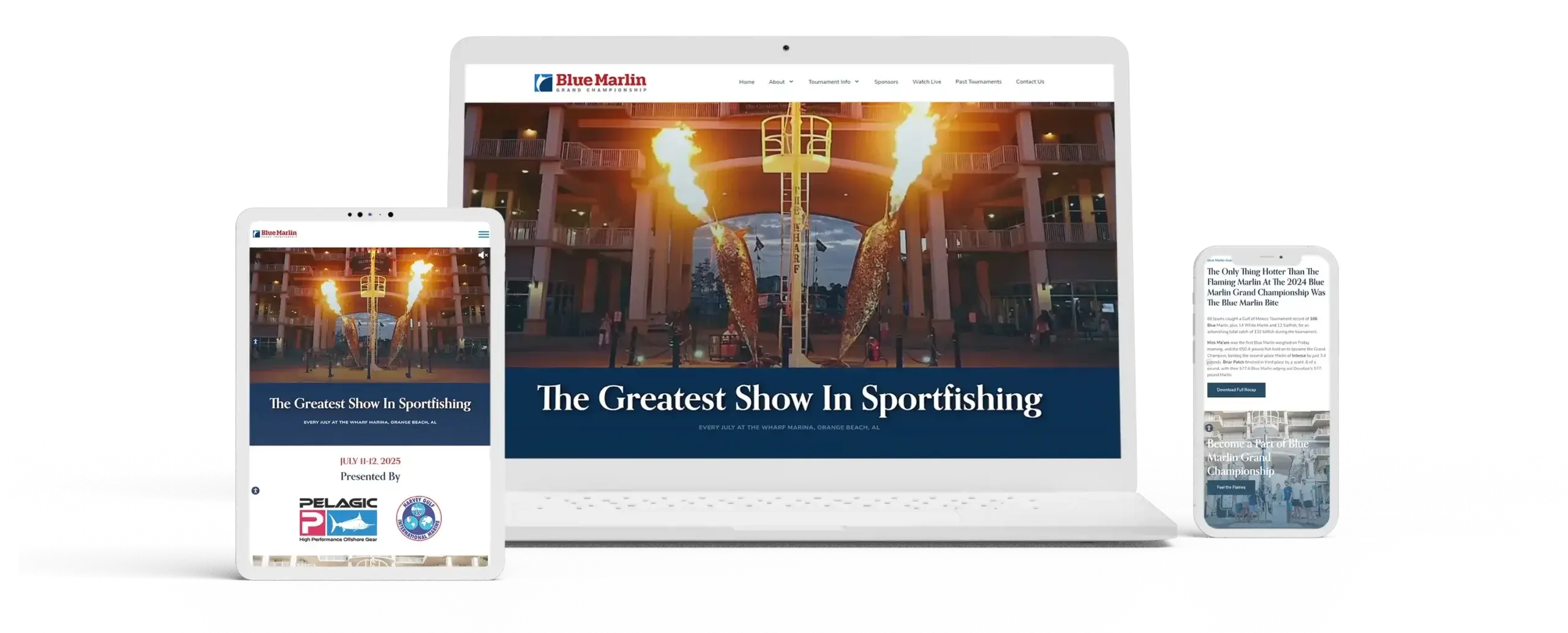
And we weren’t done there. What’s an event without a snazzy, user-friendly website? At the core of the Blue Marlin Grand Championship are live-streamed weigh-ins, scoreboards, and hassle-free sign-ups, so functionality was paramount. We focused on a streamlined, uncluttered layout, ensuring essential information wasn’t buried. But as we saw with the logo redesign, streamlined doesn’t have to mean bland. The site design pulsed with heart-pounding videos and vibrant photos of real catches and the excited teams that brought in the big ones – all encapsulating the exhilarating spirit of the event while ensuring users navigated with ease.
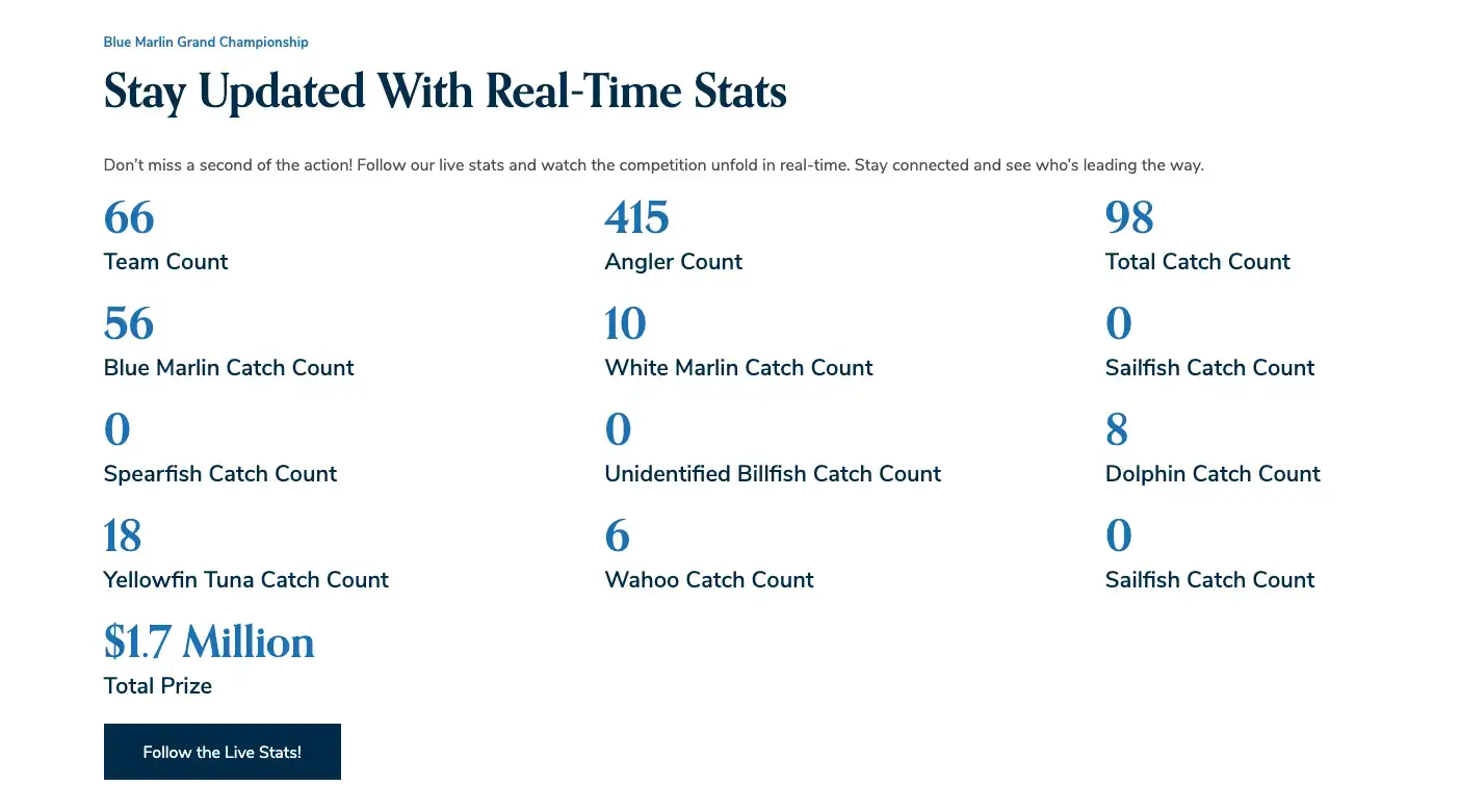
To keep the excitement alive throughout the competition, we developed a real-time stats feature that allows users to see up-to-the-minute standings and catch counts.
05 / The Results
The Blue Marlin Grand Championship, always a titan in the sportfishing world, now has the branding to match its stature. Our redesigned logo, cohesive event materials, and vibrant website elevated the event’s presence. In essence, we didn’t just give the championship a fresh coat of paint—we gave it the spotlight it deserves.