Graphic design, at first glance, might seem like just choosing the right fonts, a dash of color, and a neat doodle—easy, right? However, at Curiosity Marketing Group, it’s so much more than meets the eye. Dive a little deeper, and you’ll find that behind every polished design, there’s a backstory of brainstorming sessions, a pile of crumpled-up sketches, and countless iterations. It’s this rigorous exploration and refinement that ensures every logo, branded flier, or ad is just the right fit.
Curious about our design journey? Join us as we navigate from the spark of the initial project kickoff call to tweaking the final pixels until we’ve arrived at the finished piece. It’s a blend of art, research, experimentation, and, yes, plenty of caffeine.
1. Discovery and the Project Kickoff Call: Where Curiosity Takes the Lead
This isn’t just a meet-and-greet (although we love a good chat, too), but the moment our signature Curiosity gears up into full swing. It’s our discovery phase, the inception of our collaborative voyage, and while you can expect us to be all ears, we also come with a laundry list of important questions.
Why? Because understanding the heart of your brand is crucial. We want to know the passion, the purpose—the ‘why’ driving this project. What are your dreams for the final design? Do you envision it evoking a particular emotion or achieving a specific goal? Perhaps there are hurdles to navigate—required project specs, mandatory colors, or any unique challenges.
Unsure about the finer details? That’s okay! If you can point us to designs that make you say, “Ooh, I like that!” it gives us a great starting point.
So, when that kickoff call is scheduled, get ready to dive deep. We’re going to hit the ground running, gathering every puzzle piece and ensuring we craft a design that’s not just tailor-made for your needs but also drop-dead gorgeous.
2. Researching: Beyond the Looking Glass
Diving headfirst into design without proper reconnaissance? Not on our watch. Our research phase is a bit like a reconnaissance mission in the dynamic landscape of design. This is where we don our detective hats and scour the scene, observing what competitors in your field are concocting. What’s making waves? What seems passé? Where’s the whitespace no one’s tapped into yet?
Being aware of current and emerging trends is paramount. After all, we’re not just aiming for your design—be it a logo, ad, site, or flyer—to merely blend in with the crowd. Our sights are set higher. We aim to craft designs that aren’t just keeping pace with the times but are setting the pace. It’s about ensuring your design feels fresh off the press, bursting with uniqueness, and absolutely nails the brief.
3. Ideation: From Fleeting Thoughts to Tangible Sketches
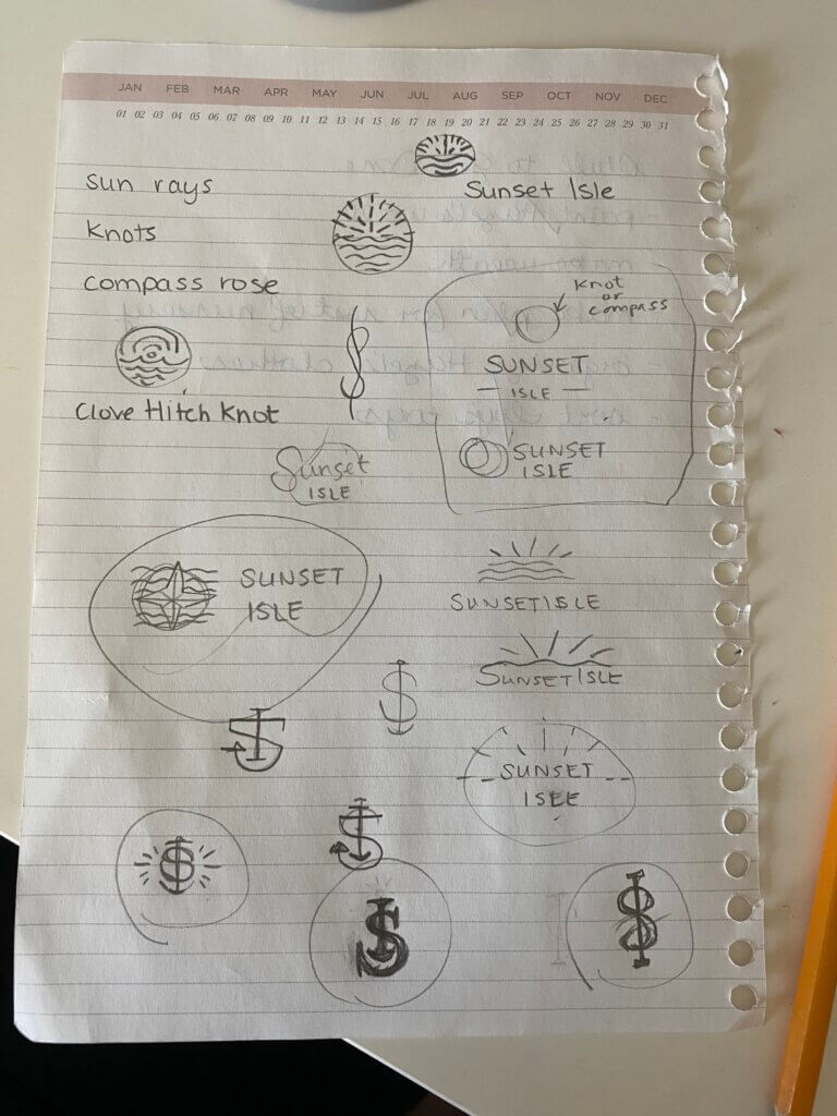
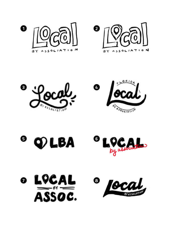
At the heart of our sketching and ideation phase is the chase: the pursuit of every fleeting idea, each potential spark, ensuring they’re captured before they vanish into the ether. This dance of creativity is not just about the pixels and vectors. Oftentimes, the genesis of our best ideas finds its humble beginnings on the tangible—whether that’s a sketchpad, the back of a junk mail envelope, or even a hastily grabbed napkin during a coffee break.
During this phase, we embrace the wild side of creativity, letting ideas flow freely, uninhibited. There’s no room for critique or judgment just yet—it’s a sacred space where any and all concepts can take root. From the grandest of visions to the quirkiest of thoughts, everything is fair game.
After sifting through and selecting the top contenders of our sketches, we then scan these concepts. Depending on the project, we might share these sketches with you as a chance for you to weigh in and, perhaps, nudge the direction of our creativity. Because while we let our imaginations run wild, we’re always anchored by your vision and aspirations.
4. Designing: Pixels, Vectors, and the Birth of Brilliance
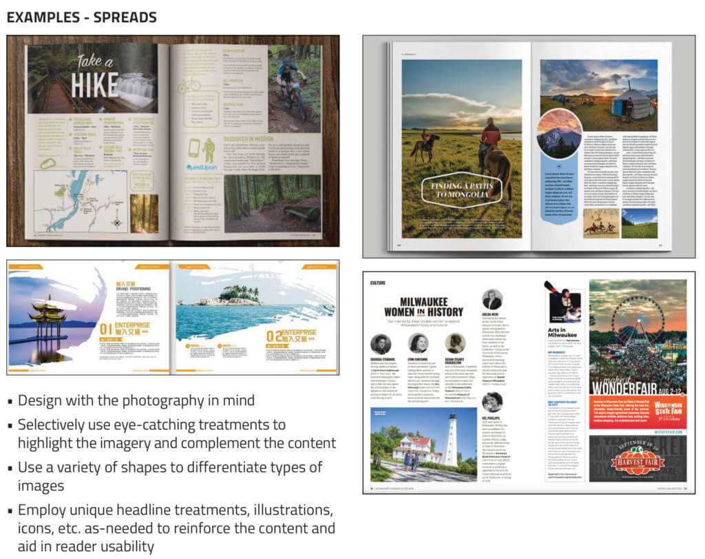
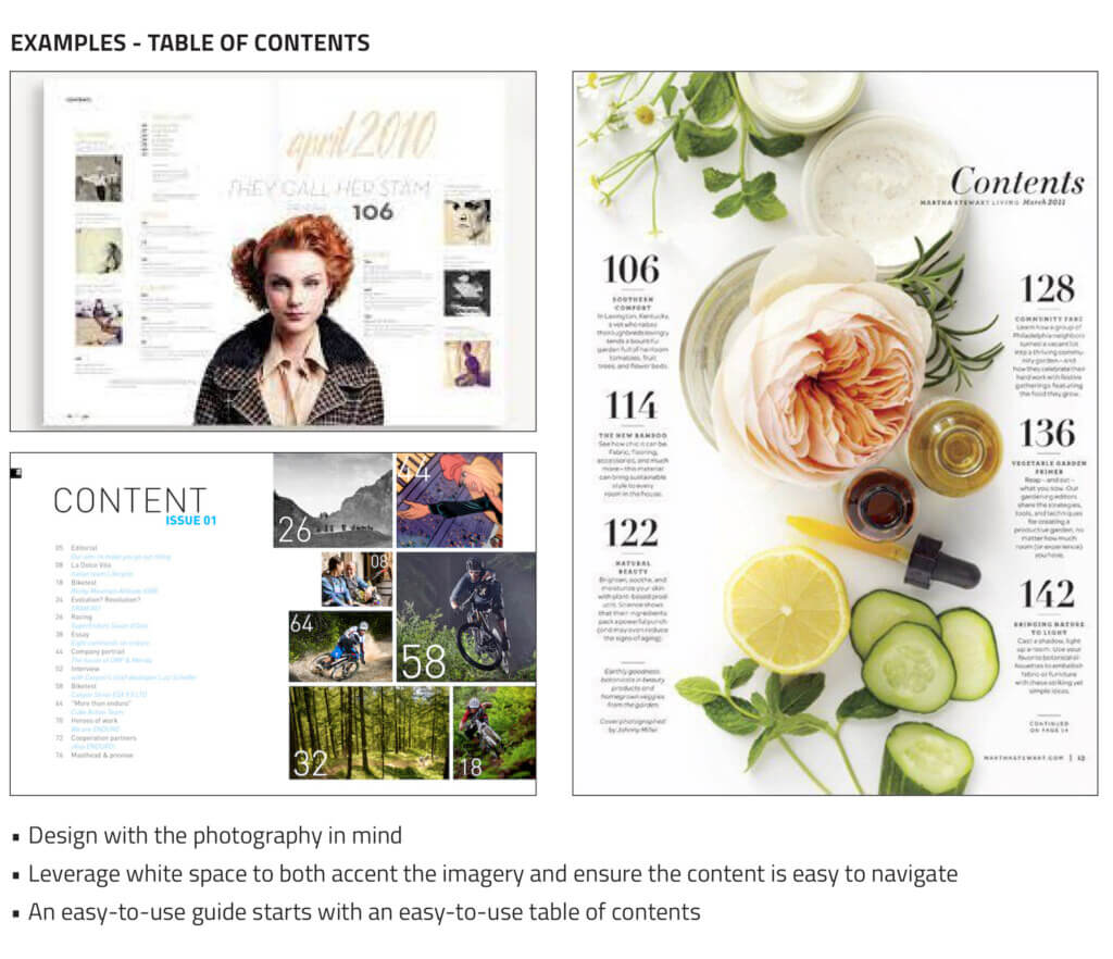
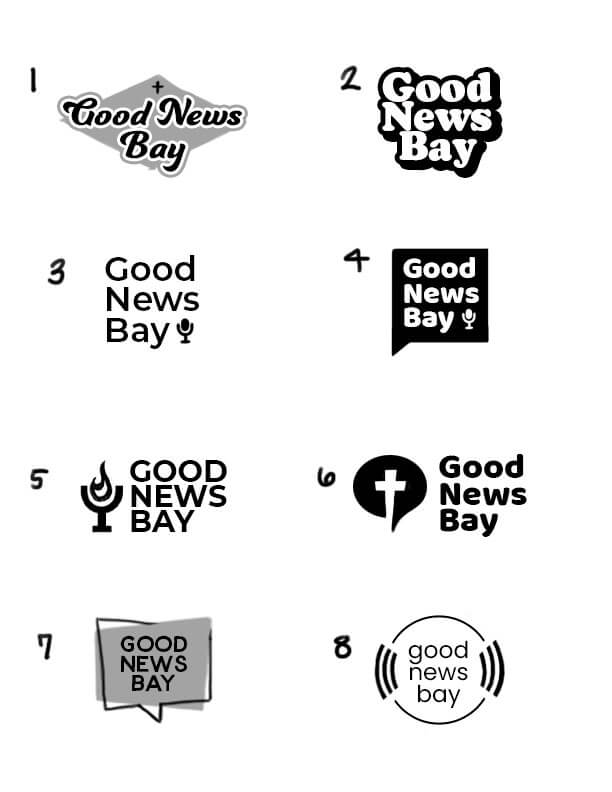
The transition from sketch to screen is nothing short of transformative. Armed with an arsenal of top-tier design tools, we delve into this phase with gusto, converting hand-drawn concepts into precise digital renditions. While those initial scribbles carry the essence of an idea, our digital phase fleshes out the narrative, ensuring that the brand speaks, the story resonates, and connections with your audience are forged.
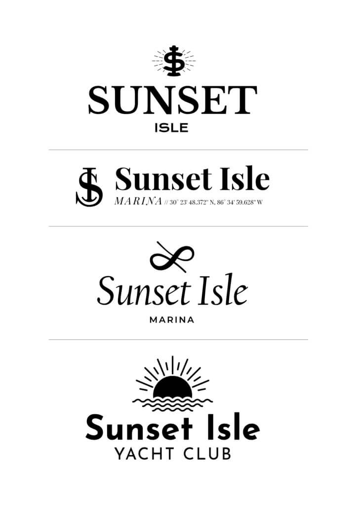
Especially when it comes to logos, we often keep things monochrome initially. Why? To ensure you’re captivated by the design’s structure and essence, not just its hue. By presenting you with a curated selection of black-and-white concepts, we offer a clearer view of the core design before diving into the colorful world of palettes.
5. Introducing Color: Painting the Digital Canvas
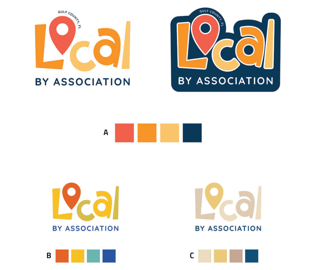
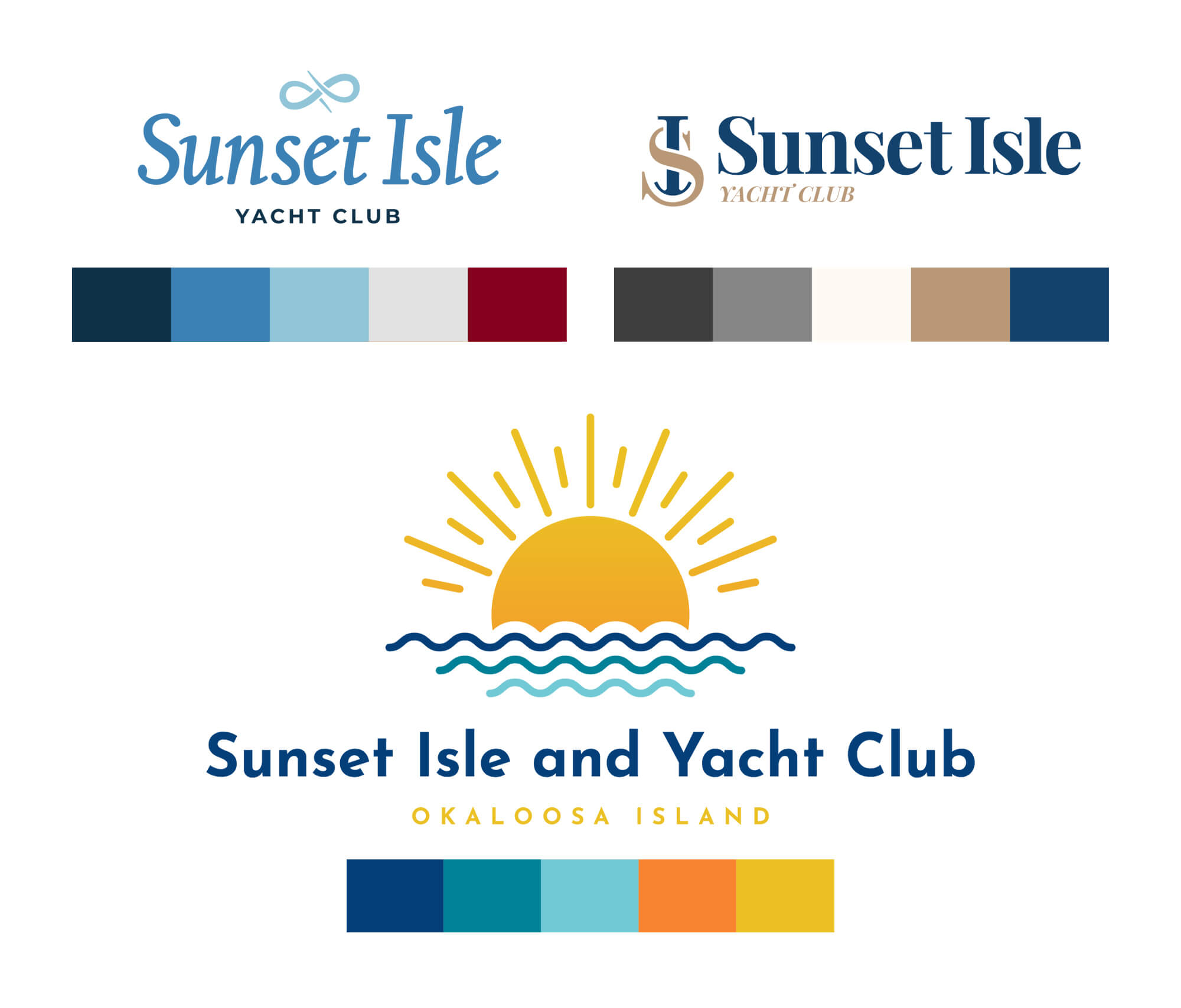
There’s something undeniably enchanting about color. It wields the power to evoke emotions, leave lasting impressions, and even shape moods. As we embark on the color palette phase, our mission is twofold: to select shades and tints that not only enhance the design but also embody the core values and aspirations of your brand.
While we do delight in presenting multiple palette options and applications, each is crafted with intention. We consider every brief and every conversation we’ve had, ensuring that our palettes not only look fantastic but also resonate with your specific needs. So, if you’re seeking something soothing and organic or energetic and fun, rest assured that the palettes we present will hit that mark. It’s a careful blend of design prowess and attuned listening. Beyond mere aesthetics, our color choices aim to capture the soul and emotion of your brand because being pretty just doesn’t cut it.
Design Revisions: Precision, Patience, and Perfection
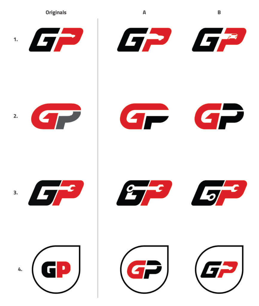
Designing isn’t a one-and-done deal. It’s an evolving process that gracefully bridges the gap between idea, execution, and client vision. The refining phase is where the art of patience truly comes to the fore. Every design, even those that seem near-perfect at first glance undergoes meticulous tweaks and adjustments. It’s all about the nuances: that shade of blue, the curve of a line, the spacing of a letter.
We pour over each design with an eagle’s eye before presenting it to you. But more than that, we genuinely look forward to your feedback. It’s not just about accepting revisions; we eagerly anticipate your insights, wanting to ensure that the design not only meets but exceeds your expectations. We’re on a mission to reach a design you’ll not just like but truly love.
Through this collaborative journey of multiple revisions, together, we refine and hone until we’re left with maybe a few stellar contenders. And then, from the brilliance of those few, one design will rise, standing a cut above the rest. That’s our champion, the winner, the embodiment of our shared quest for creativity and precision.
7. The Final Design Package: Polished, Prepared, and Primed for the World
The journey of crafting a design is thrilling, but there’s something especially rewarding about reaching the finish line. With a winning design in hand, our focus shifts to preparing it for its debut in the real world. Think of it as dressing up your design in its finest attire, making sure it’s not just visually appealing but technically perfect, too.
For logo designs, this entails creating versions in core colors and exporting them in multiple file formats. This ensures that your logo is versatile, ready to shine whether it’s on a website, business card, or billboard. When it comes to broader branding design, we go a step further, presenting you with a comprehensive brand guidebook. This guidebook serves as your brand’s bible, detailing everything from color codes to fonts, ensuring uniformity and cohesiveness across all mediums. And for those print-centric designs? We meticulously craft print-ready files, ensuring that what looks fabulous on screen translates flawlessly to paper, giving you impeccable results every time.
Bringing It All Together: Design Journeys as Unique as You
At the heart of every design process is a story—one that’s as unique and riveting as the brands and individuals joining us for the ride. While the fundamental steps might offer a familiar roadmap, each twist and turn is dictated by the one-of-a-kind aspirations and challenges each project throws our way.
While we can spin tales about our design journeys, it’s more impactful when our creations do the talking. Take a peek into our portfolio, where every design speaks volumes, and each click reveals another chapter in our collaborative saga. Because, in the end, seeing is believing, and our designs? They’ve got a lot to say!


